top of page

FAIRBROSSEN WINERY
REBRANDING + LABEL DESIGN
Fairbrossen’ is the winery and vineyards of the Bowness family. Their family name and origins are from the Lakes District in the North-West of England where healthy-living and big appetites are common.
[ Fair – Broh – sen ] Adj: “Full to Bursting” A phrase often expressed at the completion of a very satisfying meal.
This project involved a fresh rebranding, with organic, earthy label designs. All the foundation elements for these designs were hand drawn and painted to create a truely unique style for this Western Australian Winery.
Fairbrossen.com.au
PROJECT ITEMS
-
Logo design
-
Label design for main range
-
Label design for premium range
-
Label design for Sparkling range
-
Pull up banners
-
Event logos and flyers


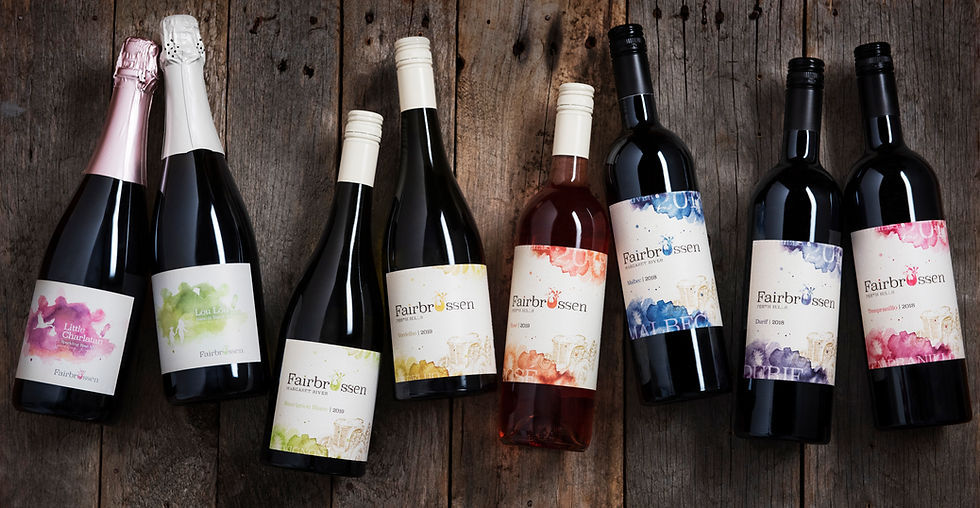
THE PREMIUM RANGE


bottom of page